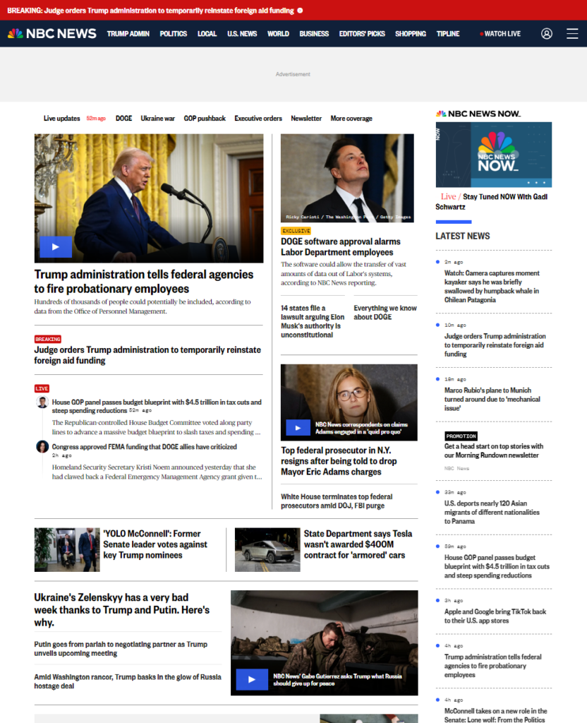
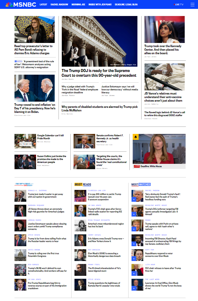
Overhauled editorial design ecosystem, allowing curation with flexibility and urgency
Project type: End-to-end ideation and design
Role: Sole UX/UI designer
Industry: News
Tools: Figma, FigJam
Duration: Q1 2023 – Q3 2024
Background
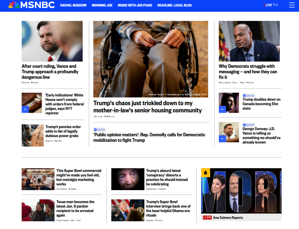
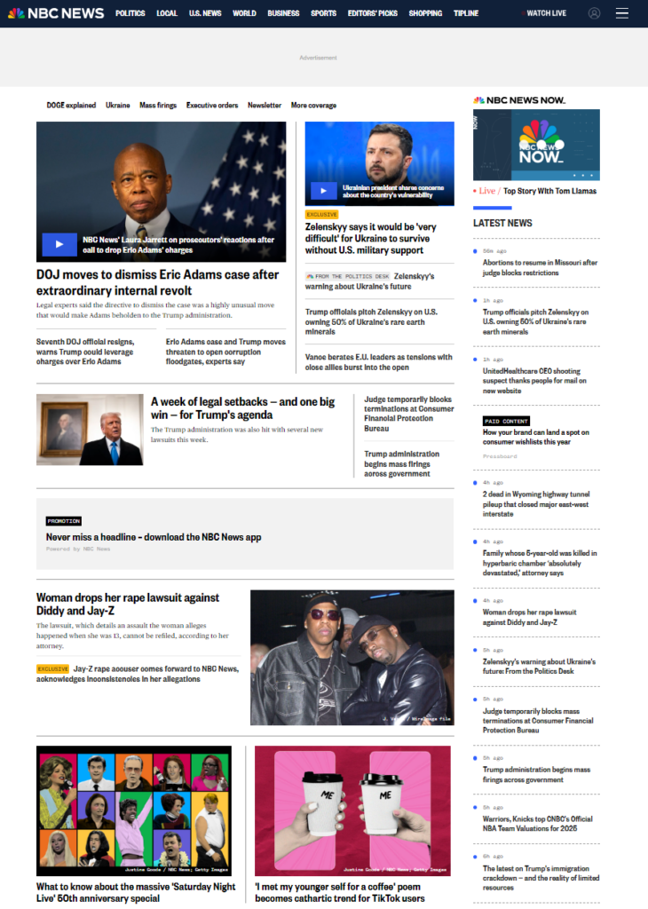
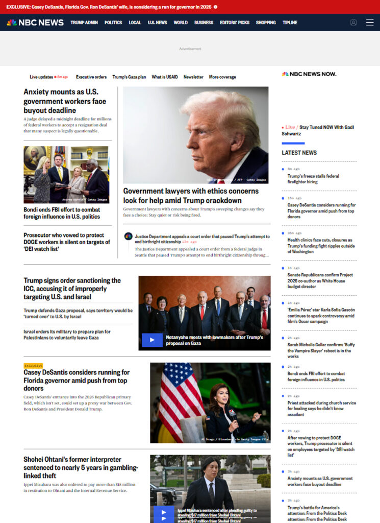
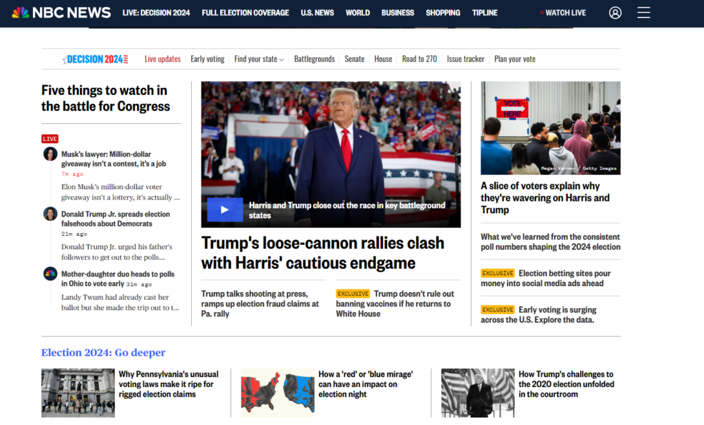
Editors in the NBC news digital space curate content on homepages and collection pages (i.e. nbcnews.com/politics) using templates which allow them to group content together. We call these “packages”. These templates were stacked on top of each other to create pages.
Here are a few examples from our old package selection:
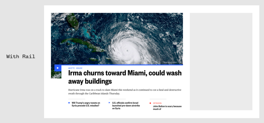
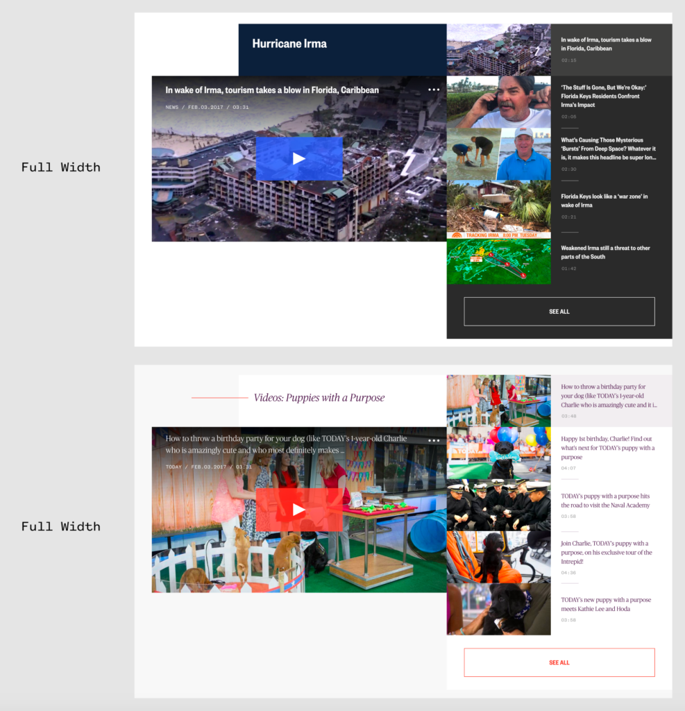
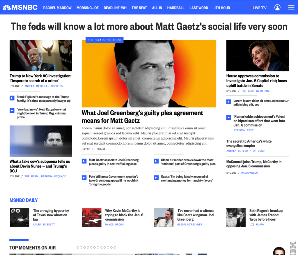
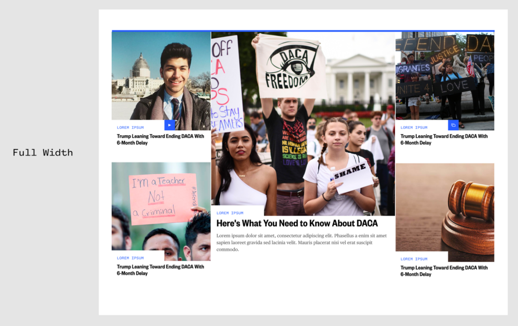
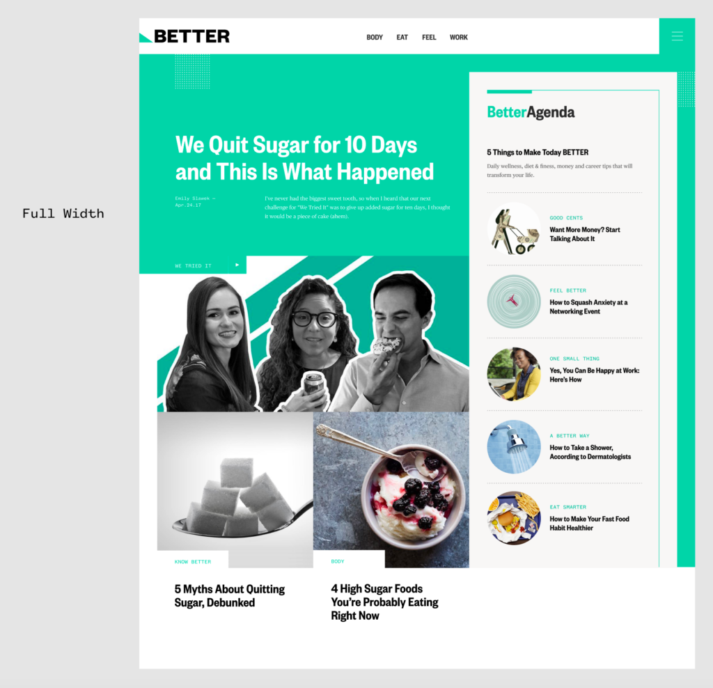
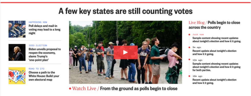
The packages and design system were created by a third party design agency in 2018 called Code & Theory. The key tenants of this redesign were:
- To have all brands (NBC, MSNBC, Today, Telemundo) live under one design system
- Leaning into an image centric, magazine spread direction
- Each package tackles a different way to curate content, taking into consideration different content types and different amounts of content you’d may want to package together
While this was a major step in the right direction, after using this design system for five years, editorial teams felt it was time to address the core issues with the design ecosystem. Leadership and my product team felt it was the perfect opportunity to gather editorial and user insights to address these long standing issues. Since NBC news is our largest brand and the leader amongst the others, we were to focus on them first.
The Problems
After interviews with editorial, users, and the art team, we narrowed down the issues:
- Editorial wanted to think through these problems mobile first, not desktop first.
- Editorial felt like there were too many options to choose from, and they still did not cover all the proper news scenarios they came across. There were 34 packages to choose from, they only felt that 5-6 were usable, and there was still much to be desired.
- Editorial wanted options for different types of news days, including: slow news days, days with multiple separate urgent storylines, and a way to evolve a news story over time (from breaking to several days afterward).
- Editorial felt the current packages were far too constricting. There was very little flexibility for how much content could be housed in a package (i.e. some packages had a range of 3-5 content items, 6-9 content items, or it was fixed). They were also limited in what content types the packages could hold.
- Editorial wanted to be able to show large, urgent stories without the focus being on imagery.
- Users felt like there was not enough content density – user goals are to get as much content in as little time as possible without it feeling overwhelming.
- Users and editorial felt like the mobile experience was confusing due to inconsistent hierarchy of stories.
- Users felt confused as to what was clickable and what was not.
- Users felt confused about some design elements (re: eyebrows)
- The art team felt like the 2:1 image ratios were not working. Photos from the source come in a 3:2 ratio and are much more ideal than 2:1. They also felt that anything blocking the images obstructed important information (see here: “eyebrows”, the link to the highest level of the article’s taxonomy i.e. politics, u.s. news).
Single Storyline
What I took away from these conversations is that we don’t want to just display articles, we want to display storylines – stories that exist in time, that grow and change with new information and have varying levels of associated content as well as urgency.
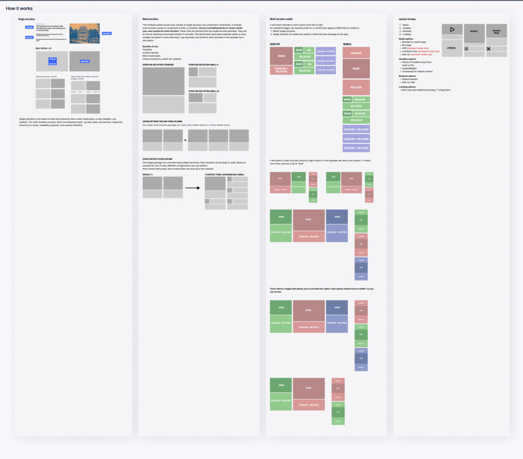
After doing some lo fidelity explorations of different visual/story combinations, I saw our first requirement emerge: We needed a way to package one single storyline, and a way to package multiple storylines. A single storyline was much more straightforward, so this is where we started:


The hierarchy would be clear and simple. All elements except the main headline are toggeable, and through research and iteration, we came up with strong defaults to automate the process as much as possible.


We ended up having:
- A 2:3 media slot (image, video, gif)
- A main headline
- Options of 0-9 related content items
- An toggleable label that does not cover the image
- A labelling system
- Two configurations based on the urgency of the news
Since multi storyline would act as an extension of single storyline (as it was effectively multiple single storylines), w built single storyline first.
We debated taking packages that already existed with the closest functionality of what we wanted to keep vs. building new. After working with engineers and project managers, we presented the pros and cons of both to leadership and ultimately decided that building new was the leanest way to go.
Multi Storyline
As intended, the following step would be the counter part to single storyline. To start this even bigger project off right, I flew to New York to run a workshop in person to hone in our vision for the multi storyline package.

After such a strong ideation session – it occurred to me that the flexibility they needed would work best as a modular system:
User Testing
News pages are a challenge to test for success because they’re often influenced by the content rather than the design. So to test, I created two pages with the exact same content, one with our old designs and one with the new designs. In our tests, we had half of the test group see page A first, and the other half see page B first to neutralize bias. It was unanimously agreed upon in testing that our new packages had better content density, content variety, and hierarchy than the old ones.
Results
Narrowing down the package options from 34 to 2 has made for a leaner and faster system which can be updated much more easily.
After NBC adopted the storyline packages, MSNBC and Telemundo voluntarily reached out because they were interested in curating their content with these packages as well. Since the election, MSNBC has been using storyline every day and Telemundo is set to start in Q2 2025.
Using storyline, NBC News experienced their most successful election homepage to date with news hitting a new viewership record for the brand with over 100M, and MSNBC getting 2.7x more views than average.
Learnings
Project fidelity matters: to show functionality only, it’s best to build in low fidelity. If you want to convince folks that you have an excellent idea worth pursuing, making it feel as high fidelity and realistic as possible is crucial.
Relationship building is key: editorial had several years of concerns not being addressed. When this team formed, they were skeptical that we would listen. Over time, we built a strong relationship, and without it, we could have never made something as successful as this.
Challenges made our product stronger: engaging with dissent and pushback with curiosity helped me solidify a stronger design perspective while building rapport with stakeholders.
User feedback makes for strong core principals: One of the reasons we were able to get the greenlight for multi storyline was because a core piece of feedback from users was that they valued content density over anything else. Multi storyline fulfilled that in a way single storyline could never do.
